
Topanga.io
One brand family, two audiences. A B2C refresh for ReusePass, the student-facing side, and a B2B implementation experience plus sales deck for StreamLine.
Date: 2026
Type: Brand system / Interactive UI/UX / Sales tools
Why: Topanga's two products talk to people who never meet. A student grabbing lunch and a dining director signing a contract need the same brand to do opposite things.
How: Shared palette and type, split by tone. Persona switching instead of four journeys at once. One brand that holds at a foot away and across a room.
Who: Loren Lam (Design) / Hussain Ali (Frontend) / Jenny Nova (Product Marketing)
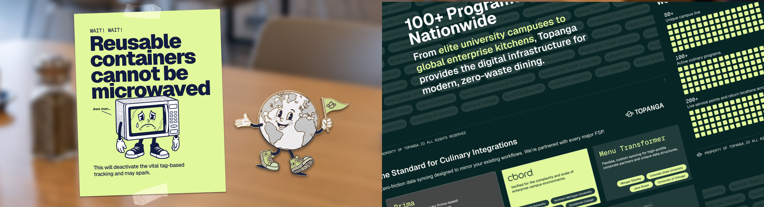
Topanga builds waste tracking for commercial kitchens.
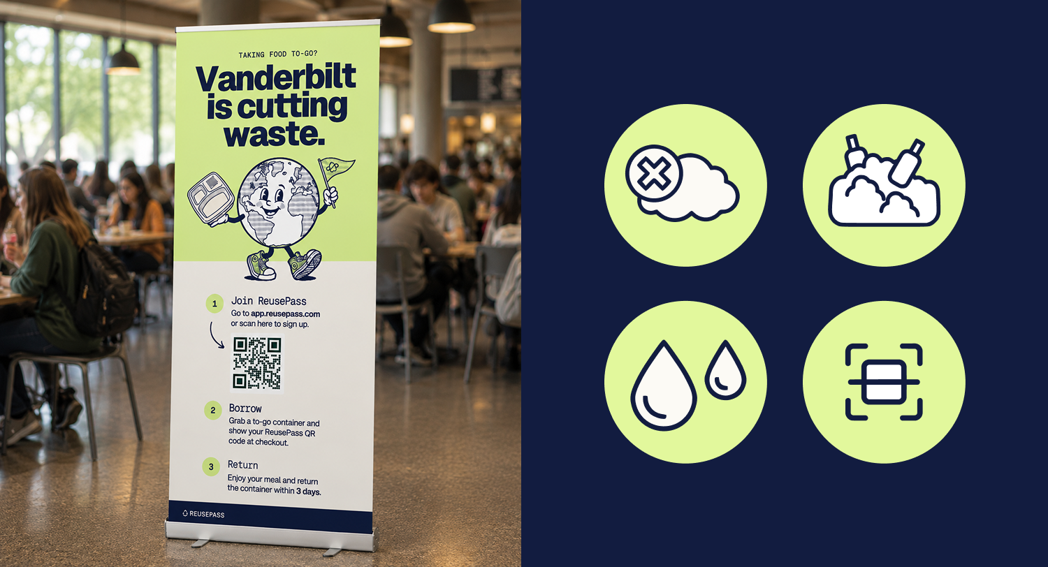
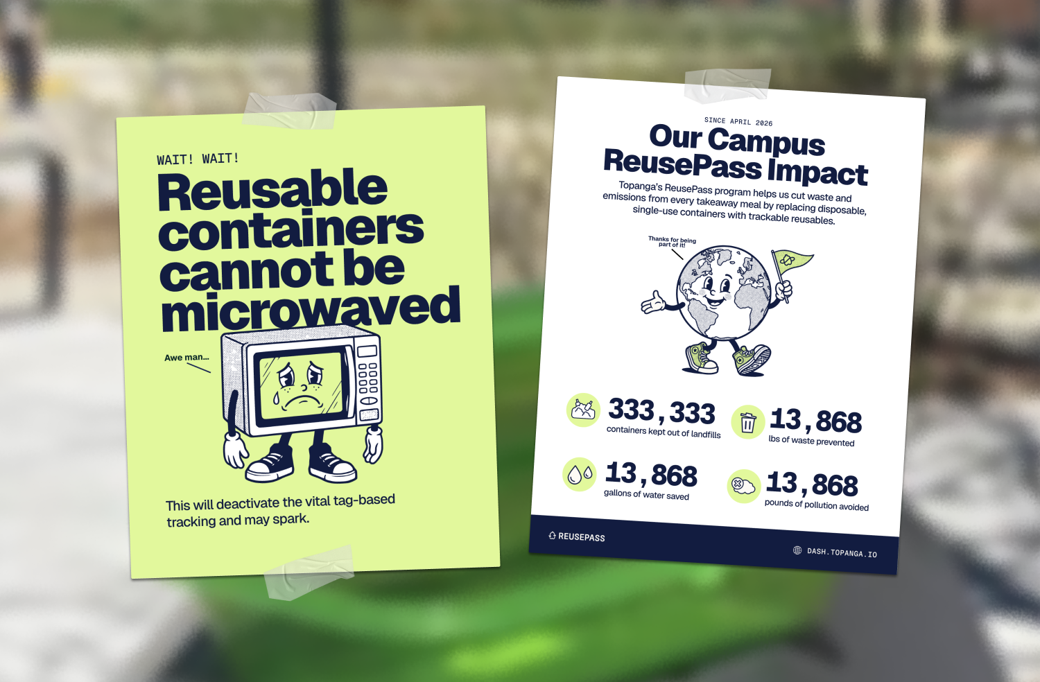
StreamLine pairs smart scales with software that shows a kitchen what it's throwing away, then turns that into production forecasts. ReusePass is the other end: reusable to-go containers students check out and return with a QR code. Campuses, hospitals, senior living.
Two products, two audiences. A dining director evaluating a contract and a student picking up lunch need the same brand to do different things.
Both sides had the same constraint. Nothing could depend on me. Campus staff make their own signage. Topanga's team makes their own decks and emails. None of them are designers, and none of them will troubleshoot a broken layout.
I worked on both.
Challenge
StreamLine gets bought by a committee. A dining director evaluates cost. An exec chef decides if the kitchen can pull it off. A sustainability lead cares about targets. A line cook wants to know what lands on their shift.
All four want to know what happens in week six. All four want to know something different about it.
Approach
You pick who you are, and the timeline reframes around you. Four personas, eight phases, week zero through week thirteen, with a progress rail that fills as you move.
Every card carries a time cost. 45 minutes for the demo. 30 minutes to review the ROI report. 15 minutes on launch day. The hesitation was about effort, so effort became the most visible thing on the page.
Each persona sees what the others are doing. While you're reviewing the contract, Ross is filming a kitchen walkthrough. Four paths, one process.
The line cook path says when nothing happens. For the first three phases, David and Jesse's cards read business as usual. A timeline where everyone is busy at every stage is the kind of thing operators don't buy.
Since the build was going to an outside Webflow contractor, I specced the interactions against components Topanga's site already used. Mobile got its own treatment: dropdown instead of tabs, cards expanded by default, and a second version with the rail removed for the team to compare.
My contribution
Proposed the persona-switching structure over showing all four journeys at once
Designed desktop and mobile in Figma, plus an alternate mobile layout
Specced interactions against existing site components to keep the build in scope
Wrote the annotations and reference links the Webflow developer built from
Ran discovery on what sales already had, so this complemented the ROI calculator instead of repeating it