Jones (formerly Jones for Quitters)
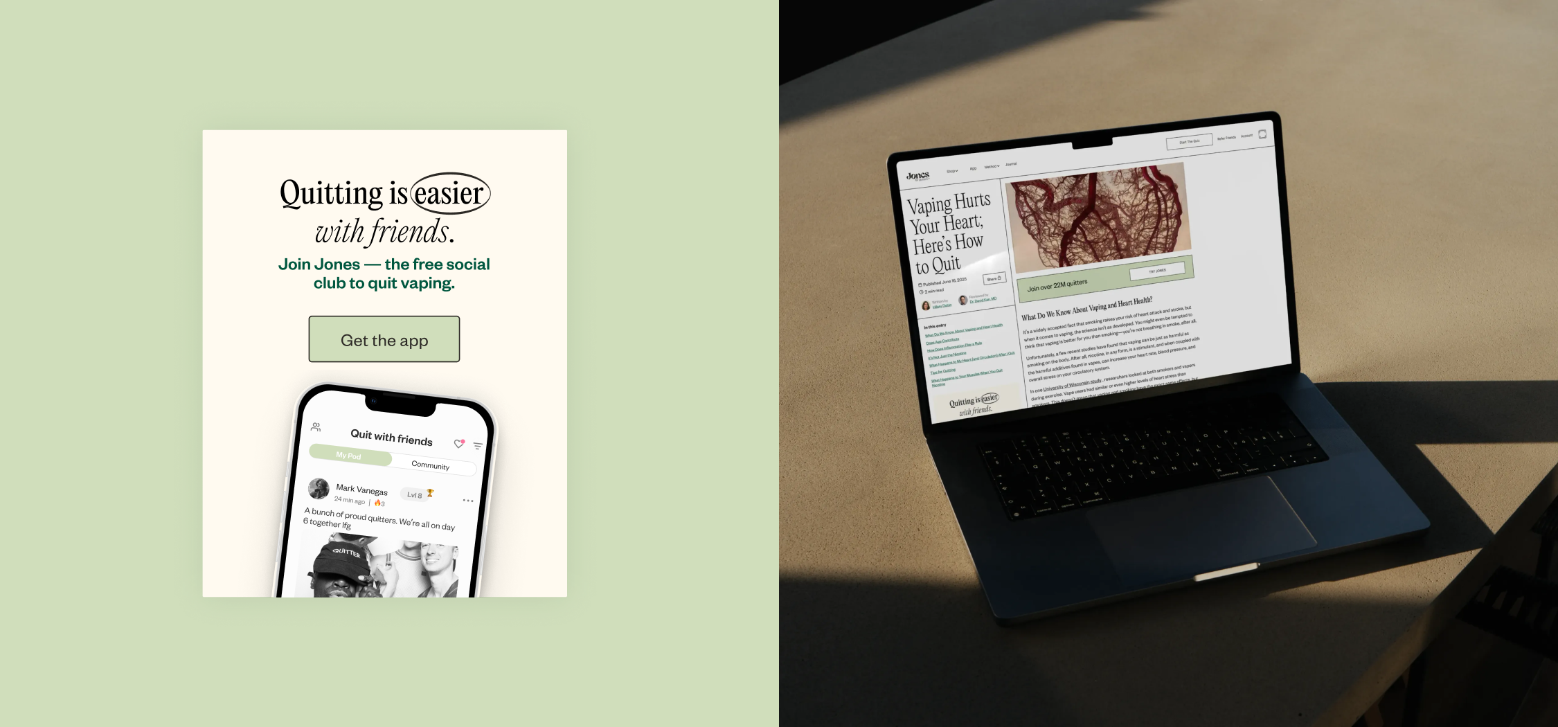
A blog redesign, then CTAs added throughout to move readers to the next stage of the funnel.
Date: 2025
Type: UI design / Web
Why: Analytics showed high readership and low engagement. Readers finished articles and left without exploring products or downloading the app. The one CTA sat at the bottom, low contrast, below a long read.
How: Three levers: visibility, timing, and clarity. A mid-scroll banner ("Join over 22M quitters") where someone has read enough to be interested, and an end-of-article CTA ("More heart. Less harm.") that hands off to product. Both in the article's own type and color, so they read as part of the page rather than an ad.
Who: Loren Lam (UI design/contract designer) / Mango Creative Co. (agency)

Jones for Quitters helps people quit nicotine through education and nicotine replacement therapy.
The journal builds the trust and points to the next step.
The trust part was working. The next step wasn't. Readers finished articles and left without exploring products or downloading the app, because the only CTA sat at the bottom below everything else.
The ask was CTAs for the existing blog pages. What worked matches the article's own type and color, so a CTA reads as part of the page rather than an insert.
Expandable sections, table designs with color, and a Reviewed by credit at the top. For health content the medical review line is the trust signal, and it wasn't there.