Hey Jane
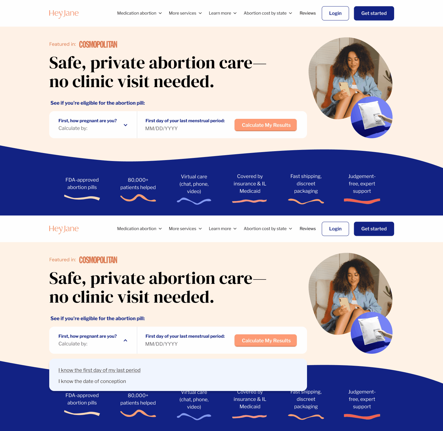
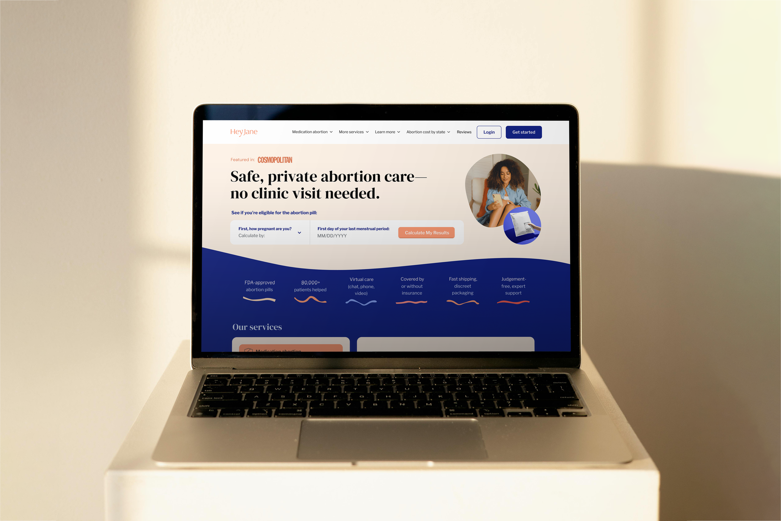
An eligibility calculator moved into the homepage hero, so people know if they qualify before they scroll.
Date: 2025
Type: UI design / Web
Role: Sr. Visual Designer (contract)
Why: Hey Jane sells FDA-approved abortion pills through telemedicine. Most people arrive with one question, and the calculator that answers it lived on an info page, three clicks in. Analytics showed people leaving before they found it.
How: The calculator moves to the homepage, right beside the headline. Make the rest feel warm and human instead of medical, and let the press and FDA mentions quietly back it up.
Who: Loren Lam (UI design) / Mango Creative Co. (agency) / Hey Jane (client)
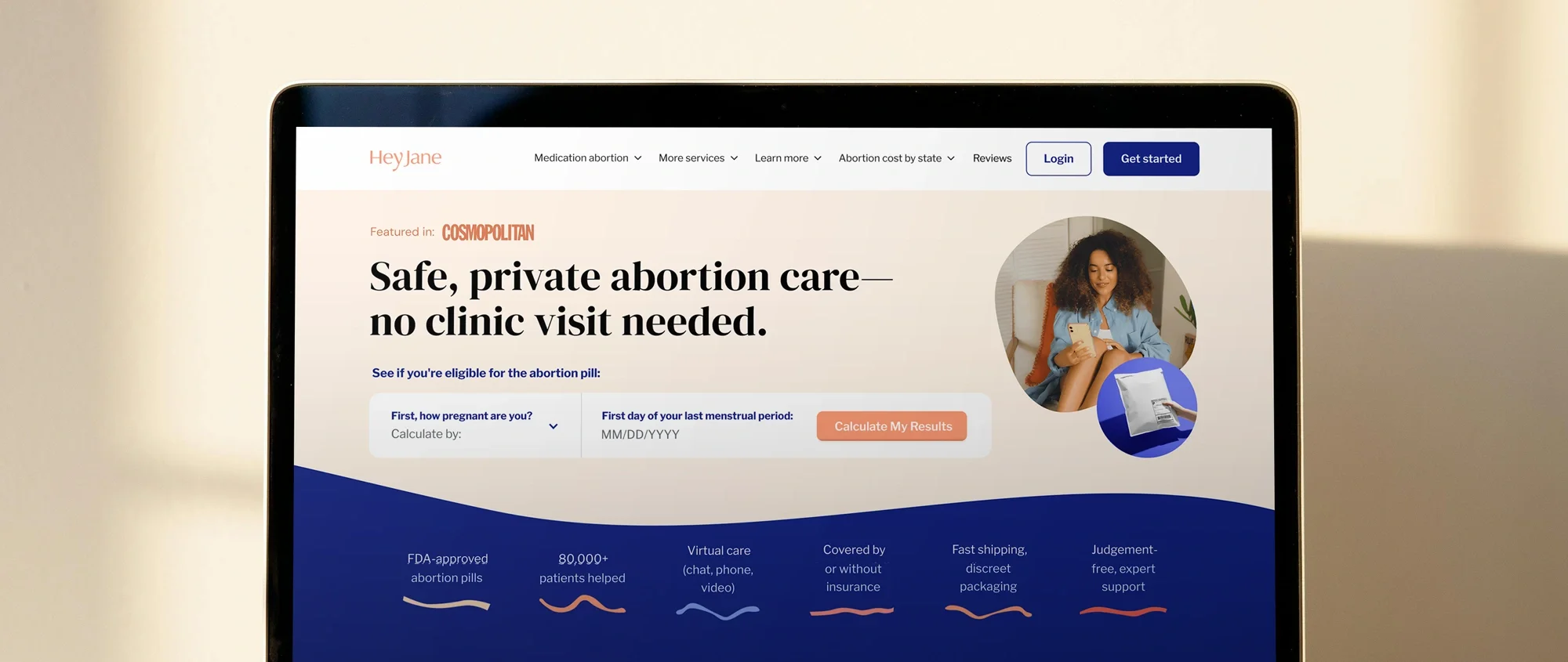
Hey Jane provides FDA-approved abortion pills through telemedicine.
Most people land on the homepage already knowing what they want. They need to find out whether they qualify, and how quickly. The eligibility calculator sat two screens below that question.
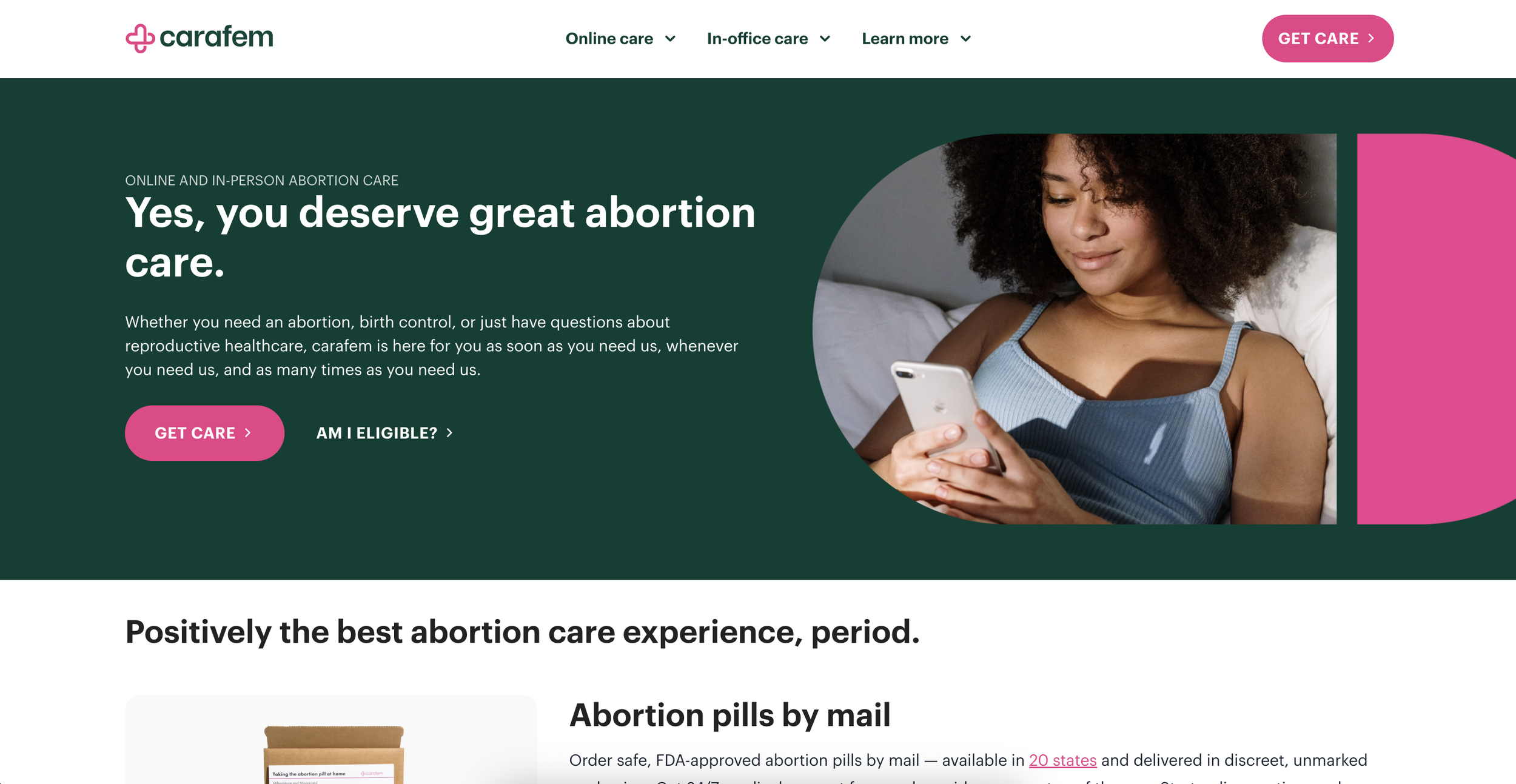
Before laying anything out, I looked at how other providers handled the same moment. Carafem put an "Am I eligible?" link next to the primary CTA, which was clear but opened a separate page.
Plan C embedded a state dropdown directly in the hero, immediate but answering a different question, where to get pills. Neither showed a visible keyboard focus state.
Inline, and answer the actual question. That set the direction.
01 / ResearchResearch
Where competitors stop short
Two sites, two different gaps.
Carafem puts an "Am I eligible?" link next to its main button, but it opens a separate page. Plan C puts a state dropdown right in the hero, which is the right instinct, but it tells you where to get pills, not whether you qualify.
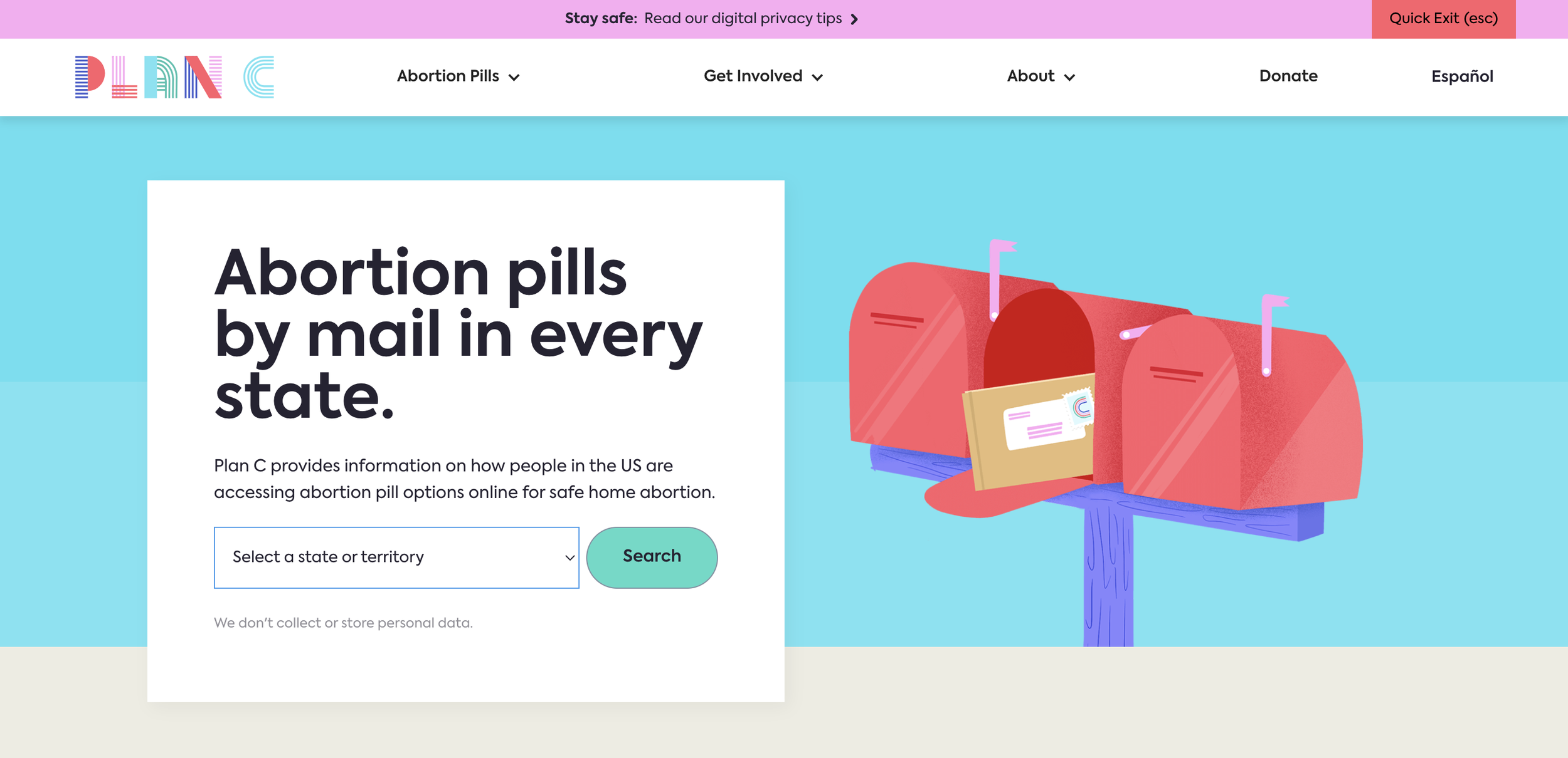
Carafem and Plan C
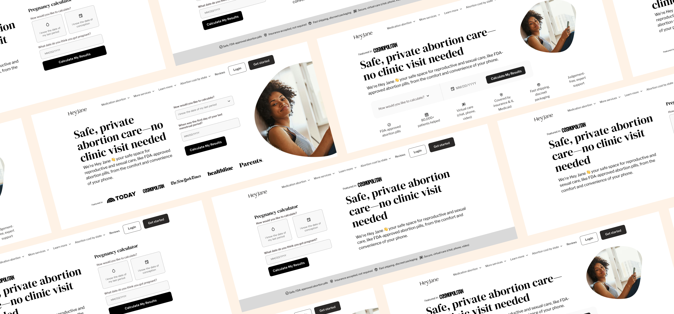
Wireframes
02 / DesignDesign
The calculator, up top.
The calculator moved into the hero beside the headline, so the first thing people see is a way to get their answer.
Warm photography and a conversational tone keep it from feeling clinical. A "Featured In" strip and quiet FDA-approval mentions build trust without shouting.
When you're in a hurry and unsure, you need an answer before you need information.