
Hey Jane
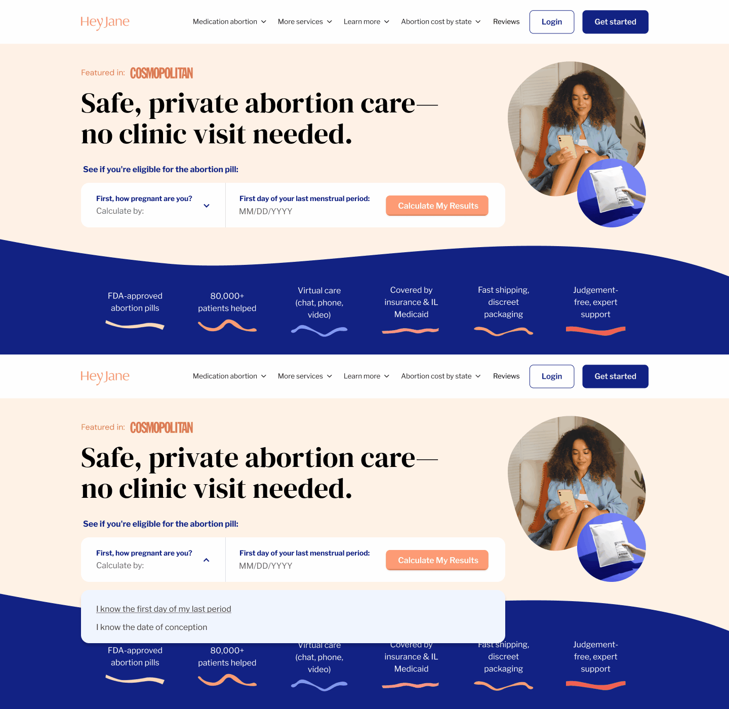
An interactive pregnancy calculator built into the homepage hero, so people can check eligibility before they scroll.
Date: 2025
Type: UI design / Web
Role: Sr. Visual Designer (contract)
Why: Hey Jane sells FDA-approved abortion pills through telemedicine. Most people arrive in a hurry, and the homepage made them scroll two screens to find out whether they qualified. Analytics showed them leaving before they got there.
How: Two inputs instead of five, moved into the hero beside the headline. Warm photography and plain language against a clinical subject. AA contrast and visible focus states, which neither competitor has.
Who: Loren Lam (UI design) / Mango Creative Co. (agency) / Hey Jane (client)
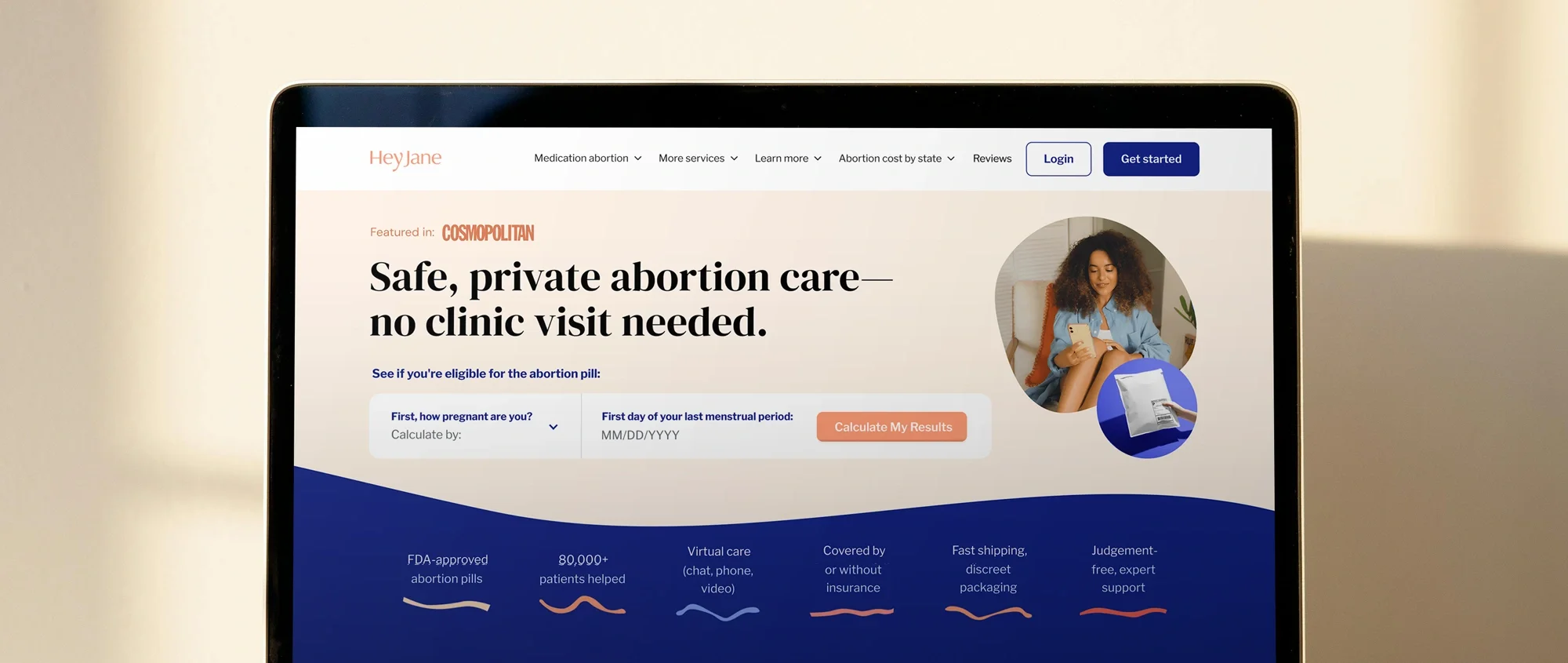
Hey Jane provides FDA-approved abortion pills through telemedicine.
Most people land on the homepage already knowing what they want. They need to find out whether they qualify, and how quickly. The eligibility calculator sat two screens below that question.
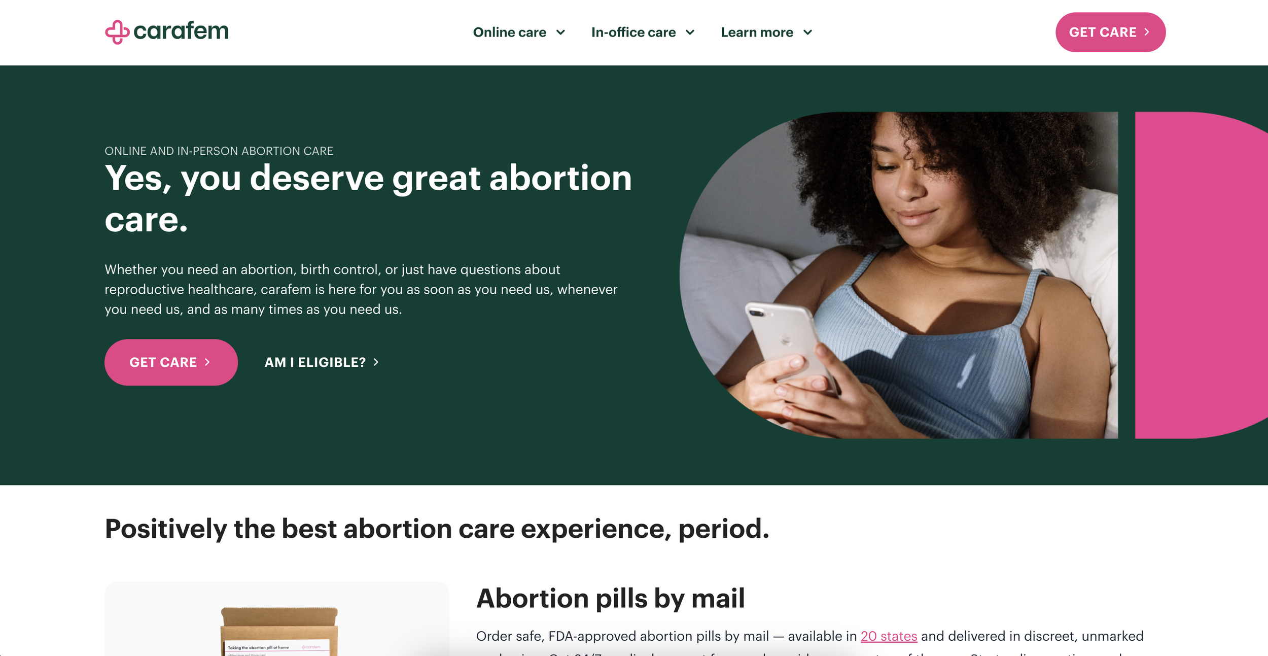
Before laying anything out, I looked at how other providers handled the same moment. Carafem put an "Am I eligible?" link next to the primary CTA, which was clear but opened a separate page.
Plan C embedded a state dropdown directly in the hero, immediate but answering a different question, where to get pills. Neither showed a visible keyboard focus state.
Inline, and answer the actual question. That set the direction.


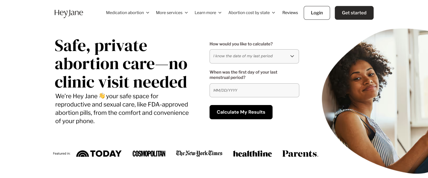
02. Wireframes
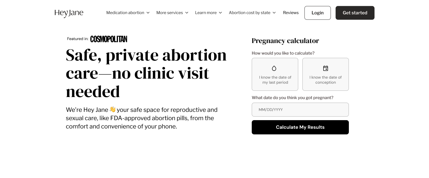
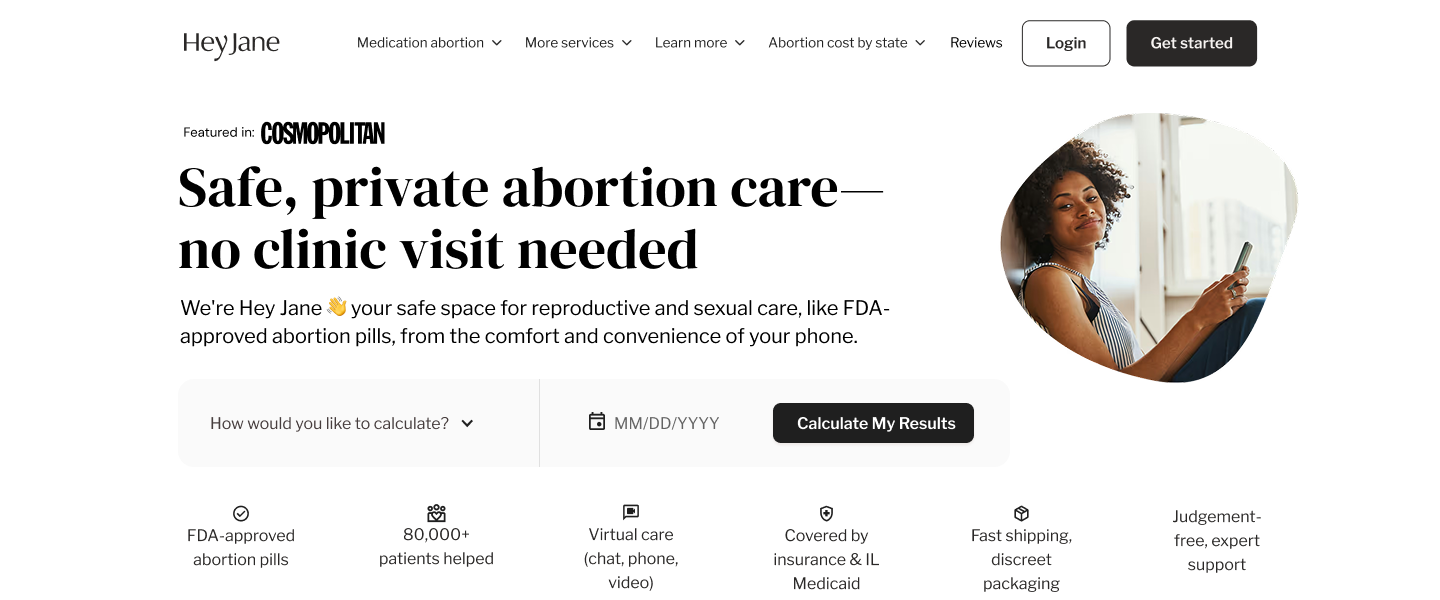
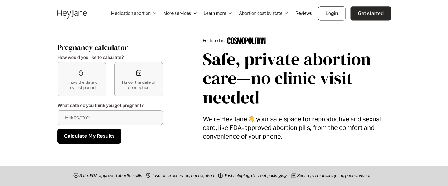
03. Design decisions:
Prioritized emotional clarity by using warm photography and conversational tone in eligibility prompts.
Simplified input to two fields to reduce cognitive load.
Reinforced trust and credibility through a “Featured In” media strip and discreet FDA-approval mentions to balance transparency with a reassuring, non-clinical feel.
04. Impact:
Improved clarity of value proposition in first scroll.
Reduced user hesitation during eligibility check.
Increase in user engagement.
06. Reflections
This project reinforced how even small, thoughtful interactions can transform user trust. Balancing empathy with clarity helped align product goals with genuine emotional connection.