Hey Jane
Year: 2025
Role: UI freelance designer for Mango Co/SFL Creative Co
Type: Brand design, web design
Toolkit: Figma, Adobe CC
Timeline: 2‑week sprint
Devices: Desktop + Mobile

Background: Hey Jane offers FDA‑approved abortion pills through tele‑medicine. Site analytics showed visitors hesitated at the very top of the funnel—many left before discovering whether they qualified for care.
Task: Goal: eligibility in < 6 s. Replace the static hero with an experience that immediately answers the question, “Am I eligible?” and encourages deeper engagement, while staying true to the existing brand voice and visuals.
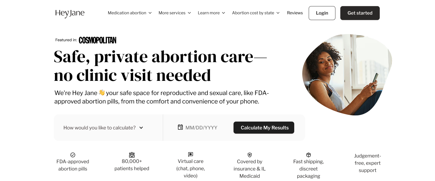
Solution: An interactive Pregnancy Calculator directly in the hero. Two quick inputs (calculation method and last‑period date) return an eligibility answer beside a clear CTA. The refreshed layout keeps the headline, social‑proof stat bar, and brand elements, but reframes them around the calculator to invite action first.
My contribution:
Competitor research
Wire-framing and high-fidelity site mockups
Developer handoff
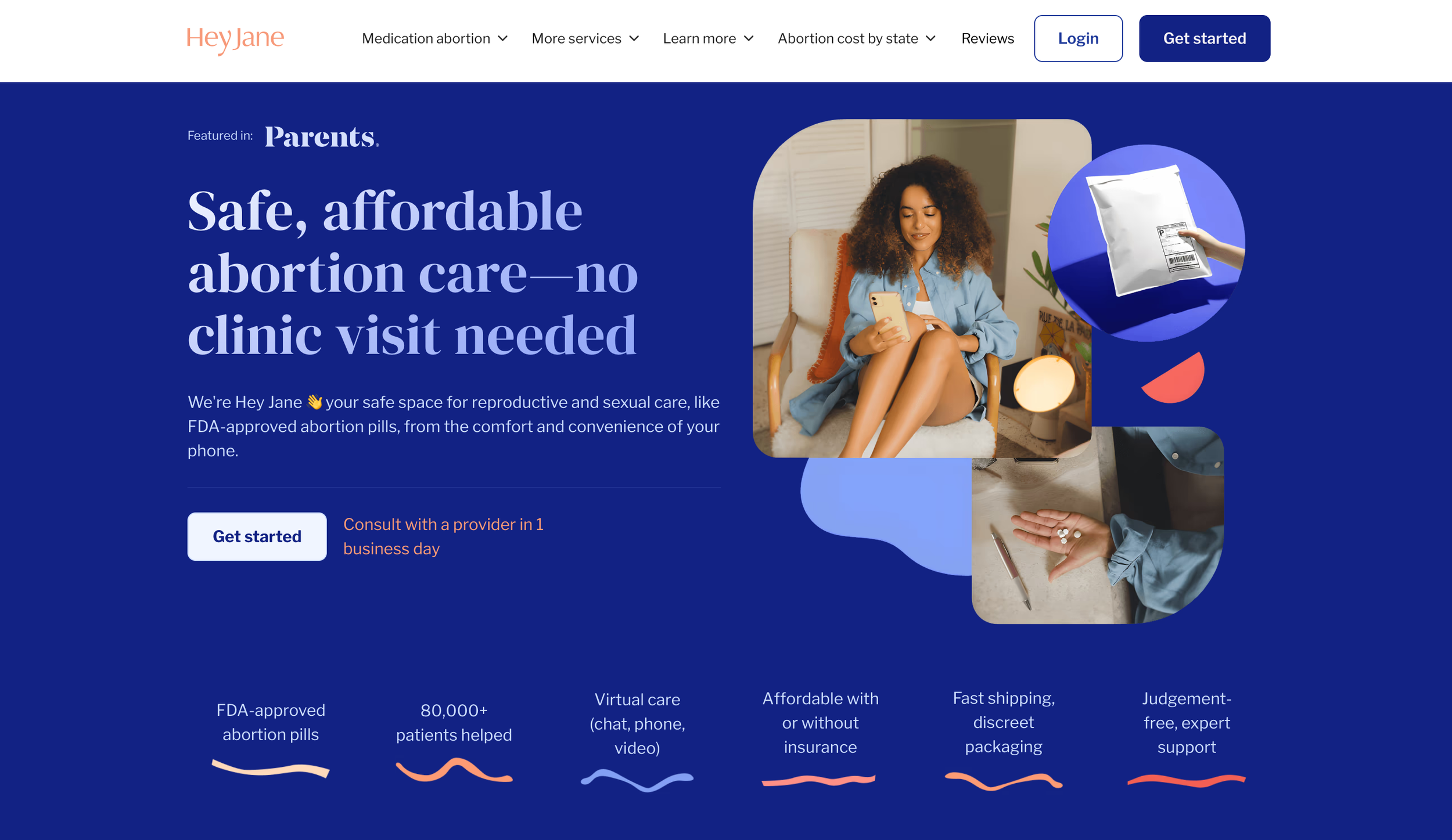
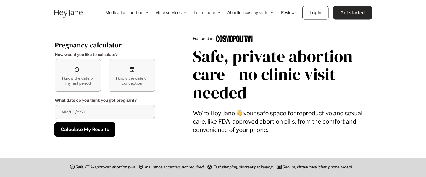
Homepage Hero Before
Many users arrived on Hey Jane’s site in moments of urgency, only to feel uncertain about their eligibility for care. Analytics revealed significant drop-off before form completion.
Our challenge: design a first-touch experience that instantly reassures, empowers, and gives users a clear path forward — without overwhelming them with medical detail.
Answer eligibility in < 6 sec.
Problem:
Many visitors arrive in a moment of crisis yet abandon the page because they can’t instantly see if they qualify for care. The existing hero is static, hides the pregnancy calculator two full scrolls below, and forces users to guess, decreasing trust and driving them to competitors.
North‑star goal:
Reduce hesitation and drop-off by helping users confirm eligibility within six seconds of landing and turning uncertainty into trust.
01. Competitor Research
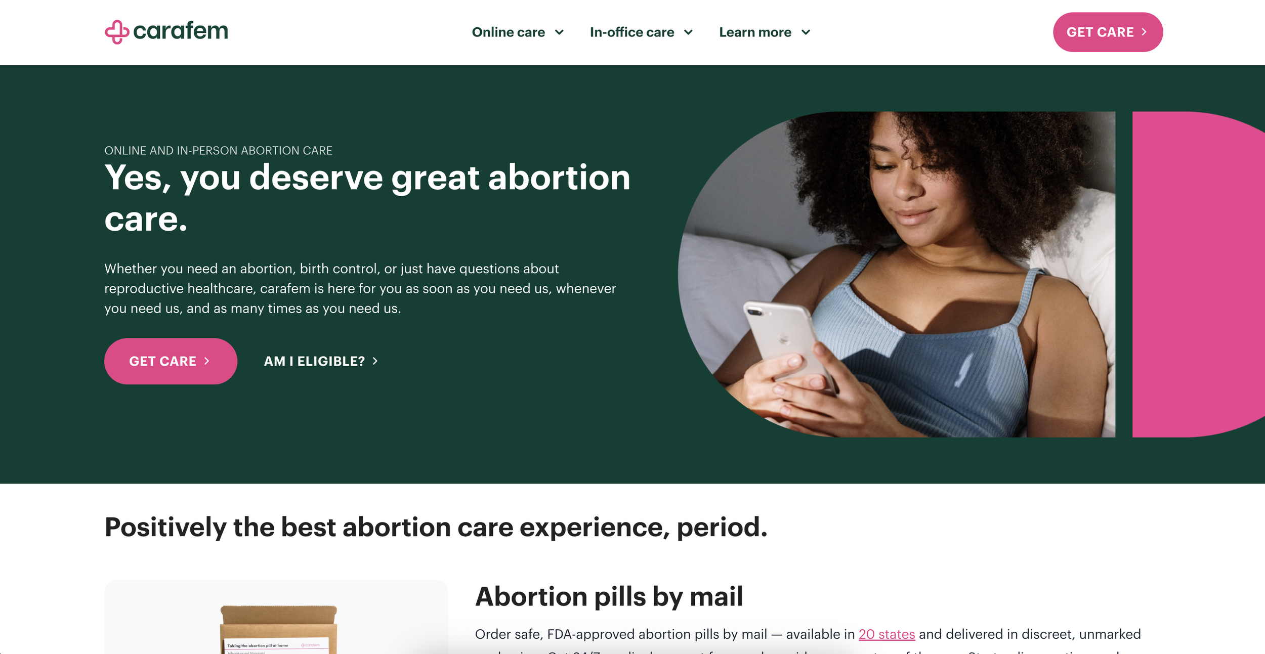
Carafem
Placement: “Am I eligible?” link beside primary CTA; opens stand‑alone calculator page
Trust cues: LegitScript badge, clinician photos
Gaps: Extra click interrupts flow

Plan C
Placement: State dropdown embedded directly in hero
Trust cues: Privacy banner, quick‑exit button
Gaps: Tells where to get pills, not whether user is early enough

Thoughts:
Inline beats out-of-line
Plan C’s hero-level interaction sets the bar: no extra clicks before users get actionable info. Carafem’s extra step shows the drop-off risk.Single-screen clarity wins
Carafem’s one-field calculator is fast, but Hey Jane can go further by surfacing the result in the same hero to eliminate even that extra page load.Accessibility is a differentiator
Both competitors miss robust focus indicators. Bold keyboard focus states and AA color contrast in Hey Jane’s hero will stand out.
02. Wireframes
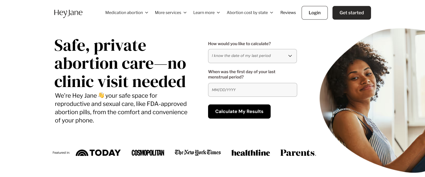

03. Design decisions:
Prioritized emotional clarity by using warm photography and conversational tone in eligibility prompts.
Simplified input to two fields to reduce cognitive load.
Reinforced trust and credibility through a “Featured In” media strip and discreet FDA-approval mentions to balance transparency with a reassuring, non-clinical feel.
04. Impact:
Improved clarity of value proposition in first scroll.
Reduced user hesitation during eligibility check.
Increase in user engagement.
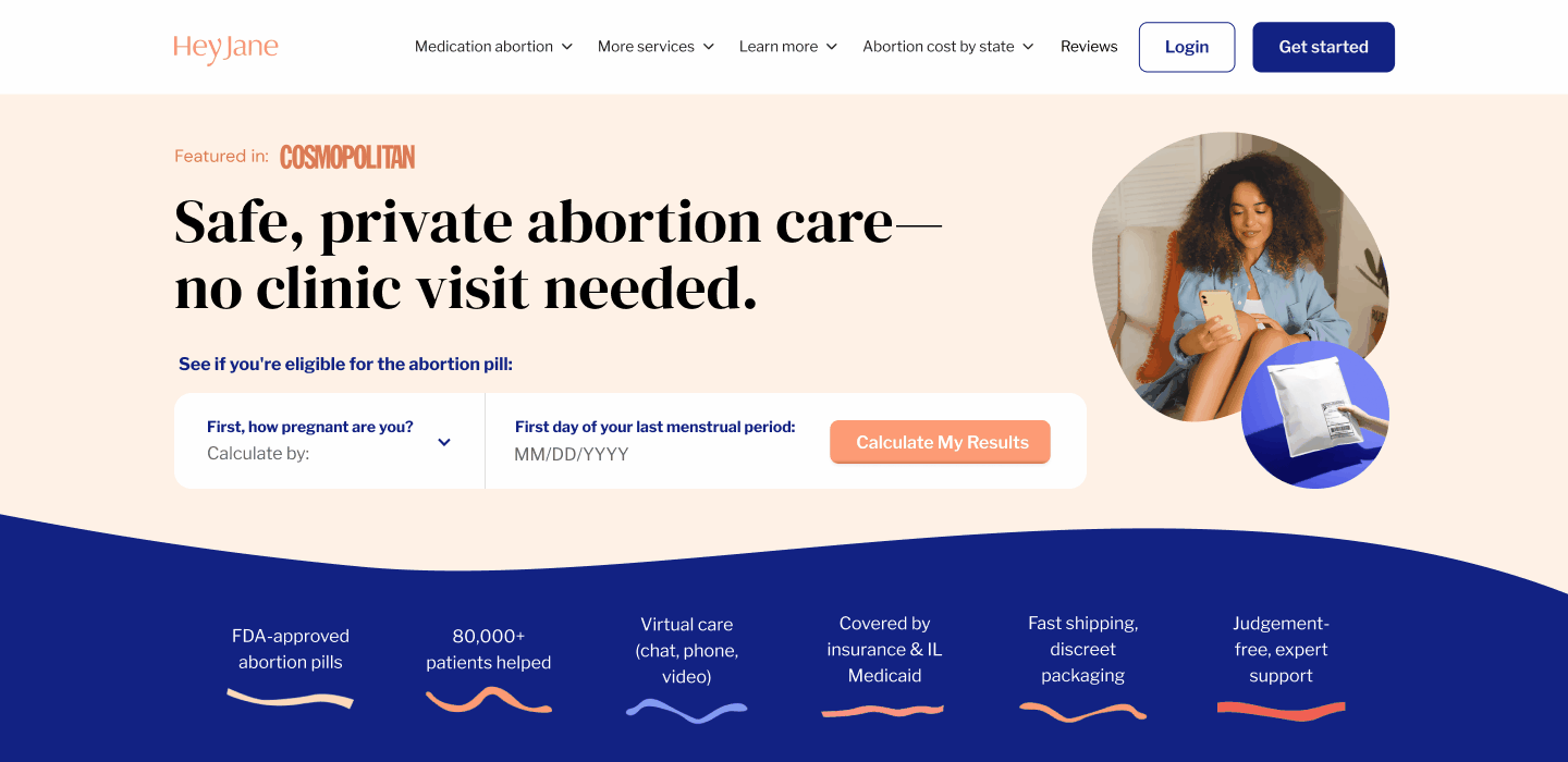
05. Final mockup and interaction
Calculation dropdown
06. Reflections
This project reinforced how even small, thoughtful interactions can transform user trust. Balancing empathy with clarity helped align product goals with genuine emotional connection.